A question on Facebook
Someone on Facebook asked whether we could add airport maps. The official ones are made for pilots and protected by licence almost everywhere, so we don’t take them.
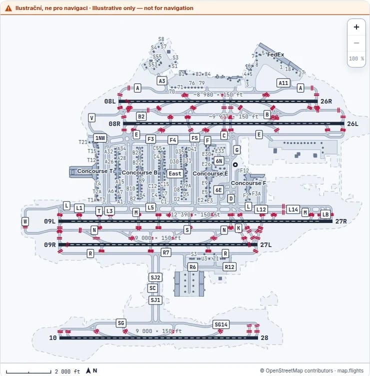
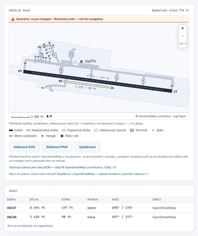
We draw our own instead, from open data: OpenStreetMap and OurAirports. It works for every airport that has runways in the data, whether that’s Atlanta with five of them or Brno with one paved runway and a grass strip beside it.
Open data isn’t a finished chart, so the drawing has to own up to where it’s guessing. Where a runway’s length is missing from the data or doesn’t match the mapped shape, we measure it from the geometry ourselves and put a tilde in front of the number. A grass runway is drawn as an outline, the way official charts do it. And an airport nobody has mapped in OpenStreetMap still gets its runways from OurAirports, with a line saying why there isn’t more.
Down to the stand
Taxiways are named after letters of the phonetic alphabet, Alpha, Bravo, Charlie, and where the letters run out, numbers join them: A1, A2. ICAO advises against the letters I, O and X, which could be confused with a one, a zero and the cross that marks a closed surface. Runway numbers are the compass heading rounded to tens of degrees, so runway 24 points roughly at 240°, and parallel runways add L, C and R.
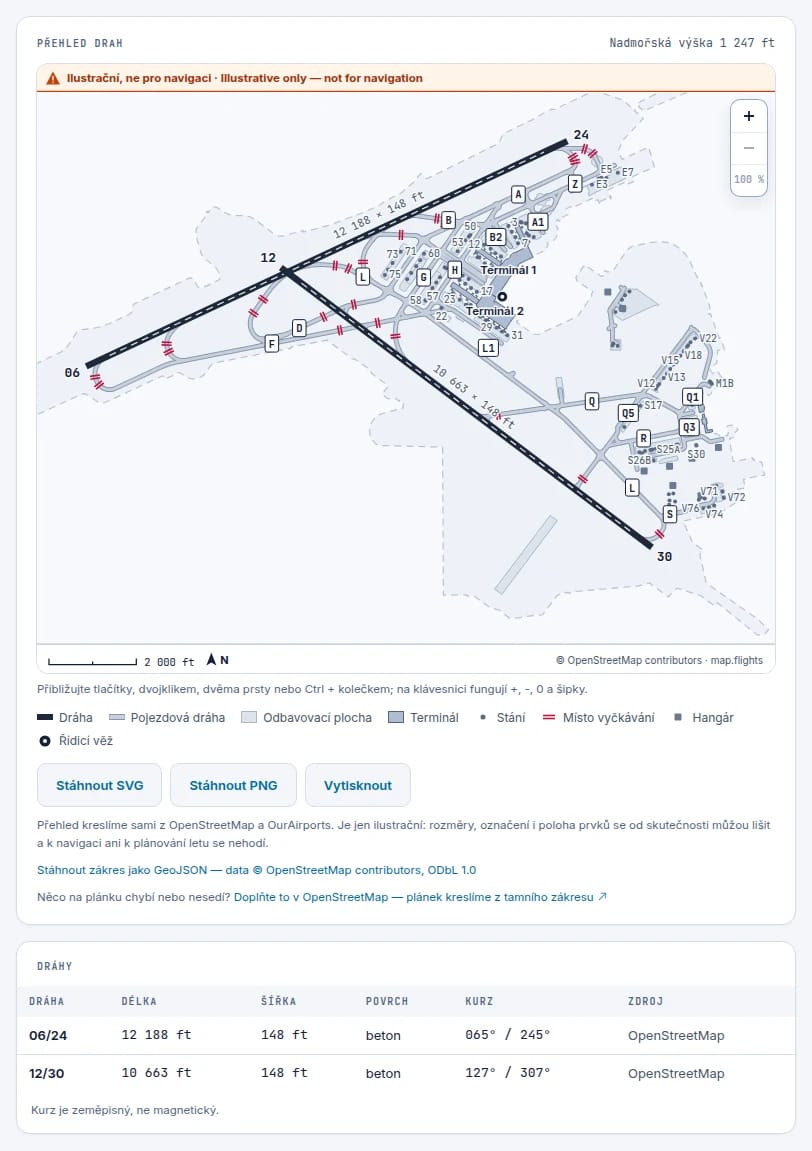
Atlanta has five parallel runways that point exactly the same way, and yet they are numbered 8, 9 and 10. Left, centre and right aren’t enough for five, so the neighbours borrowed the next numbers. In our table all five show the same heading, because the table gives the geographic heading, not the magnetic one. That’s also why Prague’s runway 06 reads 065° there: the compass in Prague points a few degrees off true north, and runways are numbered by the compass.
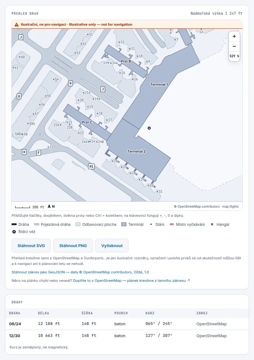
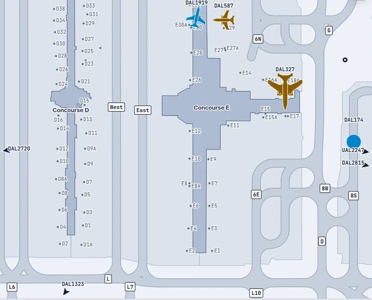
The diagram has runways with their end numbers and dimensions, taxiways with their names, numbered stands, holding points, terminals and the tower. North, a scale bar and the airport’s elevation are always there. You can zoom in until the individual stands along the piers are readable.
A passenger finds the stand the aircraft will pull up to. Spotters see which way traffic taxis to the runway, and flight simmers walk the route from the terminal to the runway before they fly it. And whoever is listening to the tower finally knows where Alpha is, and where exactly aircraft wait before runway 24.
Illustrative, not for navigation
Before every runway entry there is a holding point. On the tarmac it’s four yellow lines across the taxiway, two solid and two dashed, and at many airports a row of red lights is set into the pavement as well. Nobody crosses it without a clearance from the tower. On our diagram it’s a red line across the taxiway.
“Illustrative, not for navigation” sits prominently at the top of every diagram, and we mean it. Some things are deliberately missing: magnetic headings, ILS, frequencies, displaced runway thresholds and declared distances. Anyone who flies by a chart should have one that somebody vouches for. The diagram downloads as SVG or PNG and can be printed, and under it is a runway table with length, width, surface and heading.
Since 1 October the diagram shows live traffic too. Parked aircraft are ochre, taxiing ones blue, a landing or departing aircraft carries an arrow, and an emergency gets a red ring. An estimated position is drawn as a dashed outline; nothing fades. Aircraft in the air just outside the view get an arrow at the edge, and below the diagram the same traffic is a plain list that screen readers can read out. Scroll the diagram off the screen and it stops; hide the browser tab and it closes its connection. The downloaded file and the printout leave the aircraft out and stay a clean diagram.
Where it came from
Every downloaded diagram, SVG or PNG, and every printout carries the map.flights logo in the bottom corner, next to the address map.flights/airport/ with the airport’s code. It’s big enough to read off paper, so whoever pins it up in the clubhouse or passes it on knows where it came from.
On the light sheet the logo sits on a grey-blue plate, because our yellow pin would vanish on white paper. The file stands on its own: the logo is vector drawing right inside the SVG, with no fonts or images fetched from anywhere, and in the SVG the address is a working link. The OpenStreetMap credit stays exactly where it was.
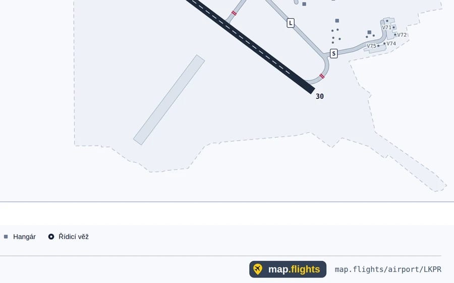
“Hold short of runway 24” now has a place on the map: a red line across the taxiway just before the runway.