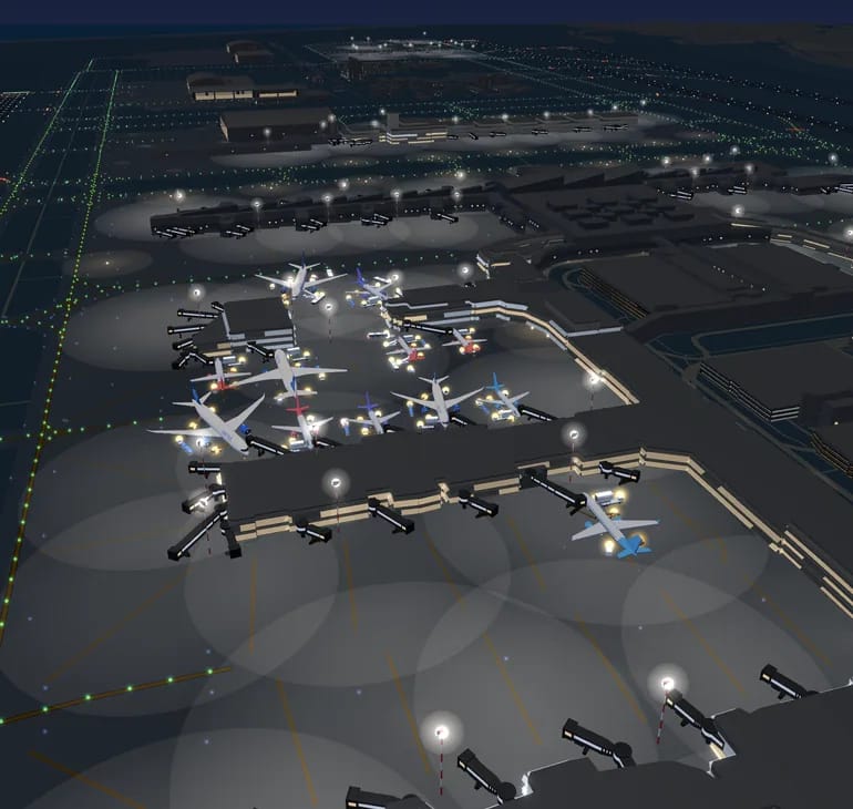
Tug or aircraft?
Far more cars than aircraft move around a big apron: tugs, buses, fuel trucks, catering lifts, stairs, de-icers, follow-me cars, and the fire service, which under ICAO rules has to reach any point of the runway within three minutes. So that the tower can see them in fog too, many of them carry their own transmitter and send exactly the same messages as an aircraft. Only instead of “airliner” they say “surface vehicle, emergency” or “surface vehicle, service”.
Display teams often fly with their transponders off, which is why Ostrava looked empty. Most vehicles, though, say nothing more about themselves. Of the 1,899 machines we heard over four days in late September at more than eighty airports, almost three quarters said just “service vehicle”. And an aircraft that sits by a hangar all day looks almost exactly like a tug in the data. What tells them apart is that one day it takes off, so a machine that never says what it is gets judged over a longer stretch of time, never from a single day.
The call sign gives away more. The fire trucks in Prague transmit as POZAR, the Czech word for fire; elsewhere it’s FIRE, ARFF or POMPIER, and somewhere a truck goes by FLORIAN, the way fire crews in German-speaking countries have long been called on the radio, after their patron saint. Follow-me cars call themselves FOLLOW or LEADER. Abbreviations that mean different things in different places we leave alone: FM is a follow-me in Hamburg and Lisbon, but in Athens the emergency vehicles carry it.
From all that, a fire truck, an emergency car, a follow-me, a tug, a bus, a fuel truck or a service van gets its own true-to-scale model. The “emergency” category doesn’t automatically mean a fire engine: operations cars and ambulances use it too, so without a telling word in the call sign you get a red car with a blue light bar, not a six-wheeled tender. Where the data stays silent, the vehicle keeps a neutral shape, because a shape that claims more than we know would be lying. Transmitters that announce themselves as a fixed obstacle, like five of them at Paris Charles de Gaulle, aren’t drawn at all. Beacons light up only while a vehicle is moving, blue for emergency crews and amber for everyone else, as on a real apron, and vehicles never count towards the number of aircraft.
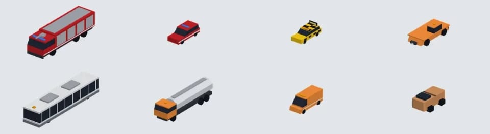
A ring in the colour of the job
On a real apron you tell the machines apart by paint and beacon: fire crews are red, follow-me cars yellow with a chequered pattern, service vehicles carry an amber light. From above, and at night, all that shrinks to a dot.
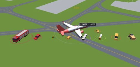
So every vehicle gets a ring underneath, like the aircraft do, but in the colour of its kind: fire and emergency, follow-me in green, handling and service vans, buses, fuel trucks, de-icers. The follow-me ring is green even though the car itself is yellow, because a pale yellow ring was impossible to tell apart at night from the yellow ring of an aircraft in the air. None of the kinds uses grey, white or blue. Those belong to aircraft and to your selection.
Vehicles are drawn twice their real size so you can spot them from above. The moment an enlarged tug would touch a wing, an engine, another vehicle, a building or a jet bridge, it shrinks smoothly all the way down to its true size, and grows back only once there’s room around it. Aircraft always have priority and never change because of a car. And a tug that touches the nose even at true size stays true size and doesn’t move an inch: the position comes from the data, the drawing doesn’t make it up.
We checked it at eight airports with real traffic, with aircraft taxiing past vehicles in 144 combinations and vehicles around forty jet bridges in Tokyo. Nothing touched anything. At night the rings glow, and a vehicle that has gone quiet fades its ring to grey while the model itself stays solid. Nothing on the apron is see-through.
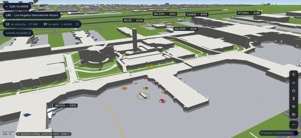
Along the taxiways
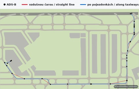
In the air an aircraft can be heard by an antenna hundreds of kilometres away. On the ground a terminal, a hangar or a hill hides it, positions arrive less often, and sometimes there’s a gap of a whole minute. Meanwhile the pilot follows the yellow centreline exactly and leaves the runway by a rapid exit, a taxiway built so that it can still be taken at around ninety kilometres an hour.
Drawn as a straight line between two reports, the aircraft would cut across the grass and through the corner of a hangar. So between two real positions we lead it along the actual taxiway network: round the bend, onto the stand, up to the runway entry, at a speed that makes sense. It is an estimate between measurements, and the map never presents it as a measurement.
One afternoon in Prague a Turkish Airlines jet drove across the grass in the 3D view after landing. The live camera by the runway showed what really happened: it had turned off early, by rapid exit J, while in 3D it rolled on down the runway and then cut straight over the lawn. The data was fine, the positions lay on the taxiway a few metres from the centreline; the drawing was at fault. Now a position on an exit counts as taxiing, and when there’s no way along the tarmac between two positions, the aircraft makes a short hop rather than drive over grass.
At JFK taxiing drawn over grass all but disappeared, at Heathrow it fell by almost two thirds and in Prague by more than a third.
Where they actually drove
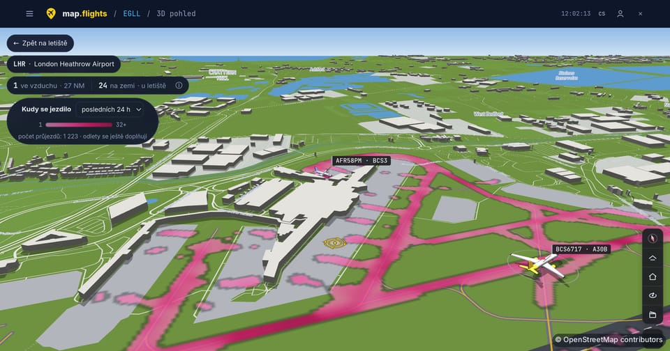
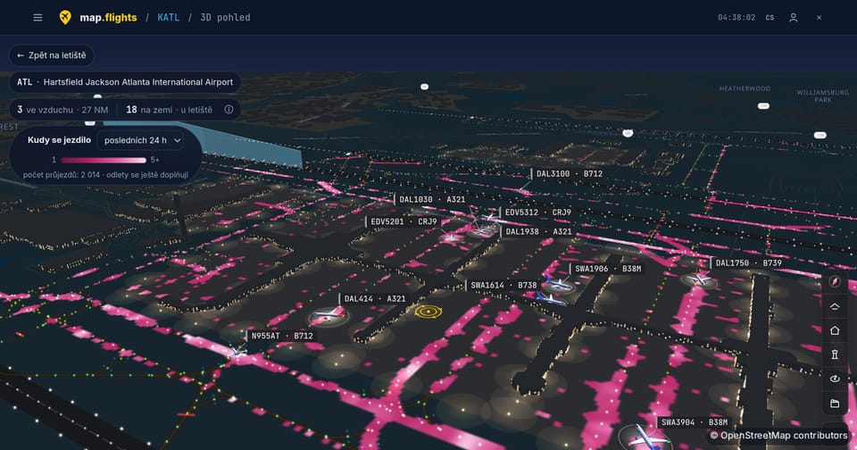
Switch on ‘Where aircraft taxied’ in the 3D view and the airport paints itself with the traffic of the last day or week. At Heathrow the main routes stand out like a map of their own, and you can see which way traffic heads out to the runways.
Only positions the aircraft itself sent from the ground count. Positions computed by multilateration drift on the ground, so they stay out, and so do vehicles. Each pass through a spot counts once, so a busy stand doesn’t outshine a taxiway, and where there’s too long a gap between two reports the map stays empty rather than filling it in.
One quirk the legend admits openly: a long-haul flight’s taxi to the runway shows up only after the aircraft has landed on the other side of the world, because we close a flight once it’s over. The map uses a single colour, a purple the scene uses nowhere else, and it lies under the buildings and under the aircraft. Nothing fades because of it.
A tug on the map is bigger than in real life. The moment it would touch a wing, it shrinks smoothly back to its true size.