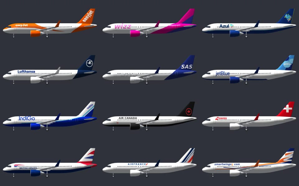
Every livery is drawn
A real livery is a designer’s drawing that a paint shop sprays onto the aircraft, and one airline wears it differently on every type. A Boeing 737 has a shorter body and a smaller fin than a 787, so the titles, the stripe and the emblem on the tail have to sit elsewhere on each.
The quick way would be to paste a photo onto the model. But a photo carries reflections, shadows and the angle it was taken from, and on a model that turns it looks wrong. So every livery is drawn: cheatlines, tail, titles, engine colours, the colour of the belly. We draw it from real photographs of both sides and then hold it up against them again. The photo is a reference for the eye, never a picture glued onto the model. A typical livery takes up less than a kilobyte and none may take more than two, about as much as two paragraphs of this text.
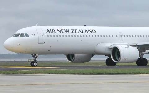
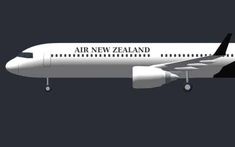
The titles took the longest. A name on the fuselage has its own place on every type: just behind the cockpit, above the row of windows and never across them. Its height is given in metres, the way it is painted, and where an airline paints it bigger on some types, those types get their own correction. On a widebody without such a correction, the title grows with the height of the fuselage, so it is not lost on a big aircraft. The lettering is our simplification: instead of each airline’s own typeface, the name is set in one of a few common typefaces, sans, serif or italic, whichever comes closest. Where the airline writes its name in two scripts, both are there, in the same order as on the aircraft.
One thing is missing on purpose: the registration on the rear fuselage. A single drawing covers the whole fleet, and if every Boeing of an airline carried the same registration, the picture would be lying.
.jpg)
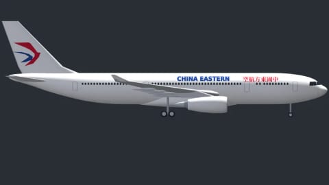
On a long-haul aircraft the name has room to breathe. China Eastern writes it on the A330 in English and in Chinese characters side by side, and in our drawing both scripts sit where they sit on the aircraft, with the swallow on the tail facing the right way on each side. The characters are real outlines taken from an open typeface and stored in the app as shapes, so they look the same on every device, whatever fonts it has installed.
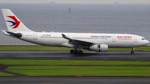
_China_Eastern_Airlines_Airbus_A330-243_B-8226_@_RJTT_2026-06-09.jpg)
Left side, right side
On a real aircraft the paint isn’t a mirror image. Titles read left to right on both sides, while every bird has its own logic. The goose of Turkish Airlines flies forward on both sides. The crane of Japan Airlines is the same picture on both sides, so on one side it looks forward and on the other it looks back. In our drawing every symbol follows the same rule as on the real aircraft, checked on photographs of both sides. Stripes and birds that the airline mirrors are mirrored, titles and numbers never.
The same emblem has to fit every type. The circle with the goose sits comfortably on the tall fin of an A350, but on the smaller fin of a Boeing 737 it would spill over the leading edge, so there it is smaller and lower. The yellow and red stripe of Southwest has to run from the fuselage into the tail on the short 737-700 as well as on the longer 737 MAX. And the IndiGo titles on the ATR turboprop fit only between the cockpit and the propeller, where the blades don’t cover them on either side.
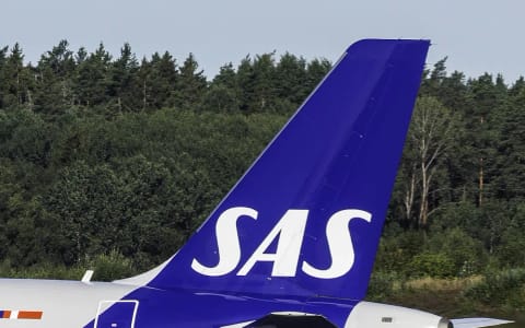
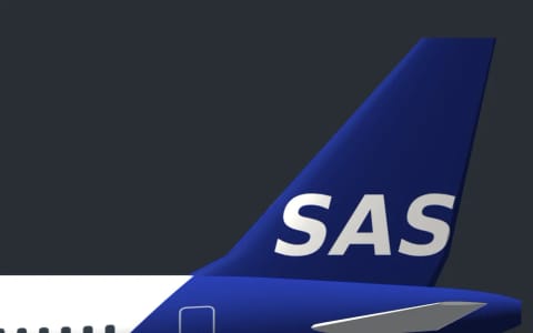
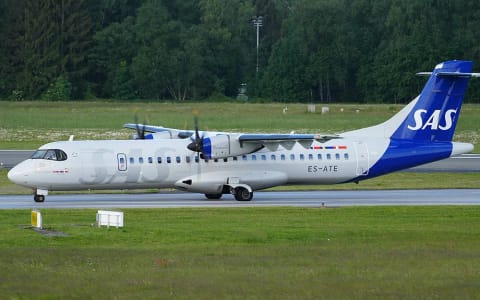
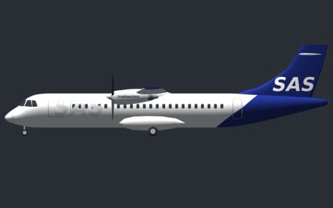
The sun, the stars, the crown, the cedar and the palm on the fins of Middle Eastern and African airlines are simplified vector shapes, never a copied logo. And sometimes a tail needs nothing but letters, as long as they are right. SAS has its name low and large on the fin, leaning forward slightly, white on a deep blue, and that is how it now sits on ours.

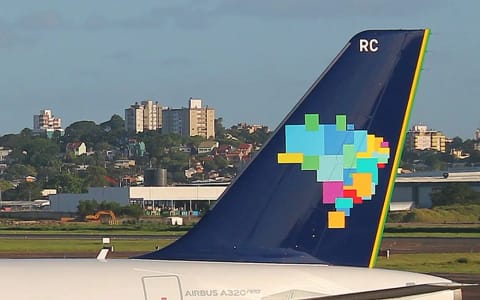
Azul paints a map of Brazil on its tail, made of coloured squares, with a thin yellow and green line along the trailing edge of the fin. A map is unforgiving: turn it the wrong way and every Brazilian sees it at once. Ours has the two green squares at the top, the bulge on the left and the point at the bottom, on both sides.
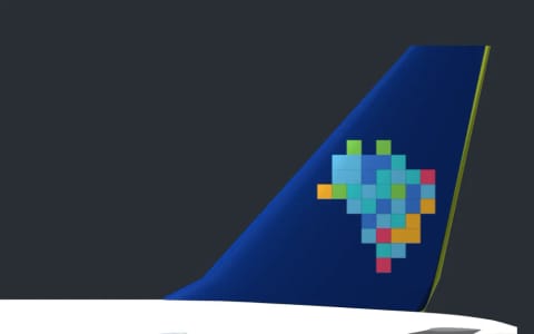
.jpg)
How the models grew up
The first models were little more than a tube with wings. Round by round they gained real noses, measured per aircraft family from the manufacturers’ dimensioned drawings, cockpit windows as a shape, engines with fans, propellers with blades and landing gear with the right number of wheels.
An A380 got two full rows of windows, a 747 its hump, a Chinook two rotors, a C-5 the huge wing it really has. Helicopter rotors spin the way their maker builds them: seen from above, the rotor of an Airbus helicopter turns clockwise and that of an American one the other way. A Cessna’s windscreen covers the whole front of the cabin, and like every window on every model it is solid dark glass: nothing on the aircraft is see-through.
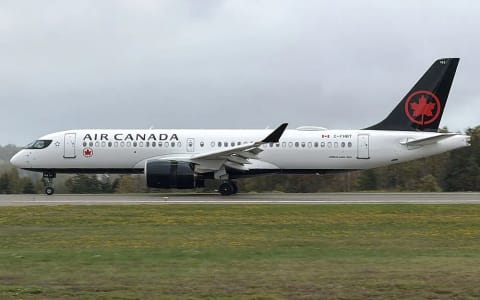
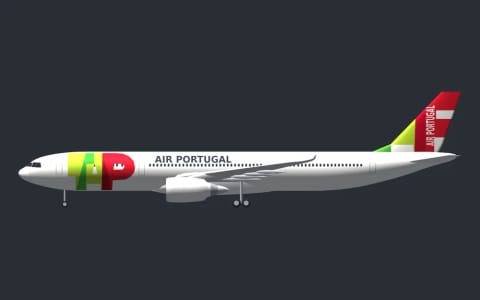
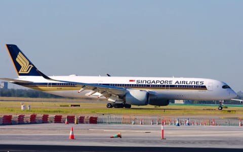
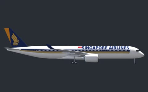
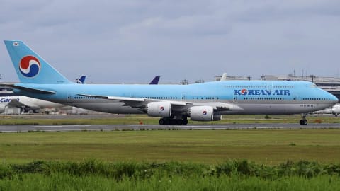
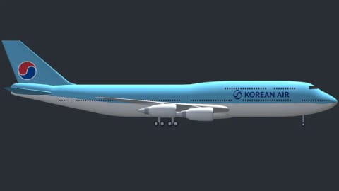
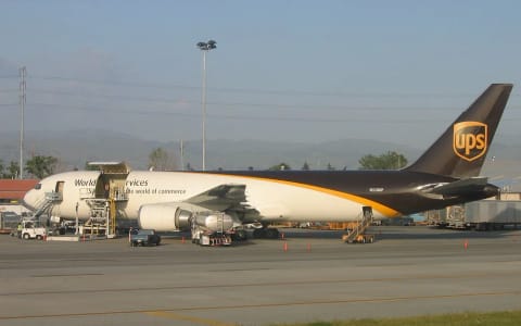
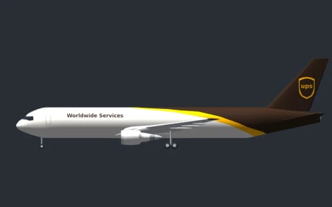
In early October a whole group of types got a new body, each drawn from the manufacturer’s own drawings: the A220, the ATR 42 and 72, the A330, the A350 and the Boeing 747 and 767 families. The 747 has its hump with the upper-deck windows, the ATR its high wing with the main gear in pods on the sides, the A350 its curved wingtips. Next to a photo of the real aircraft, the outline matches.
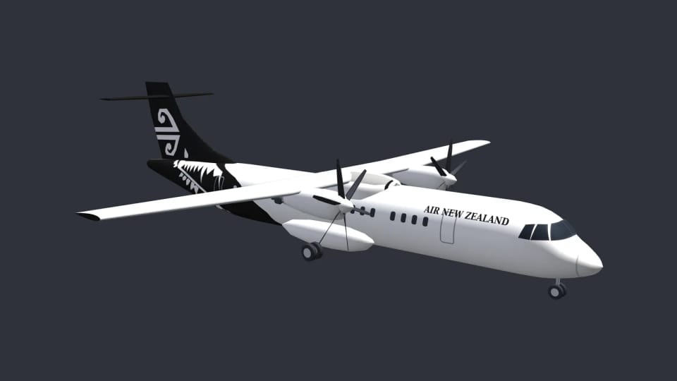
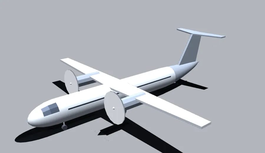
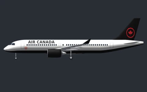
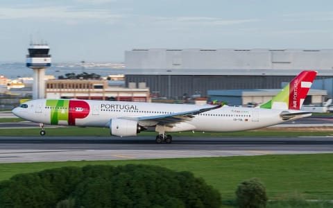
Six of the new bodies, each next to a photograph of the same side of a real aircraft. The liveries on them are ours too.
A220-300 · Air Canada
ATR 72-600 · SAS
A330-900 · TAP Air Portugal
A350-900 · Singapore Airlines
747-8 · Korean Air
767-300F · UPS

.jpg)
.jpg)
_Singapore_airlines_in_Brisbane_(BNE).jpg)
_Korean_Air_Boeing_747-8B5_HL7644_@_RJAA_2026-06-12.jpg)

Nine flights out of ten
At the end of September 243 aircraft types had a detailed 3D model, and together they covered roughly nine flights out of ten. Zoom far out and a simpler model takes over, but it takes its colours from the same livery, so an aircraft never changes colour as you move away from it.
In the Middle East, Turkey and Africa alone, the share of flights shown in their own livery rose from 37.8 to 92 percent in a single round. And a callsign doesn’t always say whose colours the aircraft wears. Regional airlines in the United States fly in the colours of their big partners: SkyWest flies for several of them and gets the livery of the one it flies for most often, United Express, while Republic flies as American Eagle. Leases and sister companies work the same way, so the livery follows the aircraft, not the callsign.
Some tails we leave plain on purpose. Alaska Airlines carries the face of an Alaska Native man, Aeroméxico an eagle knight and Frontier a different animal on every aircraft. We don’t draw people or portraits, so those tails carry only the airline’s colours.
The crane of Japan Airlines is the same picture on both sides of the tail, so on one side it looks back. On our models it does too.